Tints, Shades, Hues: – Colour Theory for Mosaics
In colour theory, there are many terms that are often not understood and can add confusion.
-

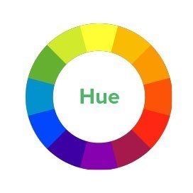
Hue – The Colour Wheel -

Tints, Tones and Shades -

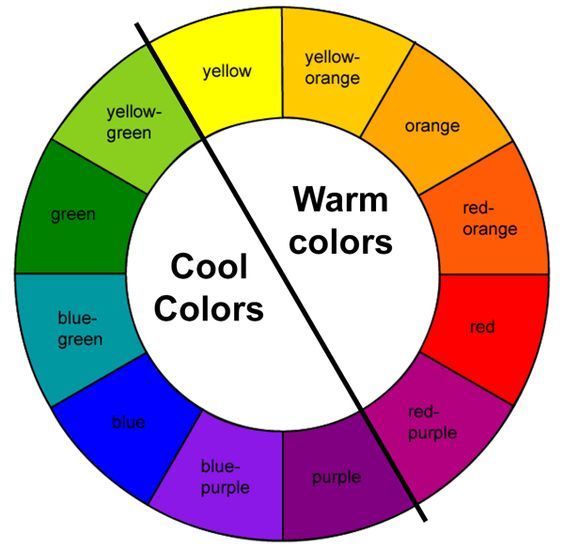
Cool and Warm Colours -

Analagous Colours -

Complementary Colours -

Split Complementary Colours -

Triadic Colours -

Opposite Colours
- A hue is a general term that simply means colour.
- A tint is a mixture of a colour added to white.
- a shade is a mixture of colour with black added.
- A tone is produced by mixing a colour with grey (in effect adding both black and white).
Mixing a colour with any neutral (black, gray, or white) reduces it’s saturation (or value), but the hue remains unchanged.
In painting, the artist can mix their own colours, so an understanding of these terms is very important. In mosaics, we are unable to change the colour of our materials (the one exception is grout), so tinting, shading and toning have to be achieved by tricking the eye. Because of this, many starting out in mosaics ignore these subtleties, which can result in works lacking in depth.
Another problem that mosaicists often come across is that, although a work may contain different hues (for example red, blue and green), when it is grouted, the subject matter loses definition, and is hard to see. This is usually because all the colours have the same value.
An easy way to check this, before grouting, is to take a photo of the work, and convert to black and white. If the image still shows up, then all’s well. If not, consider swapping out some of the colours for their tints or shades, or highlightiing the key subject in a contrasting grout.
-

Aquarium – original -

Aquarium – B&W render
When considering the colours to use in a compostion, one usually first choses a core colour – which is the main, or dominant colour in the work.
Thought should be given to the accent colours as the scheme selected can impact the dynamism and energy of the final piece. Accent colours are the secondary colours used in the colour scheme. These can either be analogous, complementary, triad, split complementary, or neutral.
- Analogous: Colours which are next to each other on the colour wheel. These colours typically go well together, and are a safe choice. Examples are blues, greens and purples or reds, oranges and yellows.
- Complementary: Colours directly opposite each other in the colour spectrum or wheel. These colors are highly contrasting and look very bold if put together. Such combinations usually draw the eye and stand out very well. For example, blue is opposite of orange on the color wheel. Complementary colours make each other seem more intense, and give the work more energy.
- Split complementary: A mix of two analogous colours and the complementary colour of the one that is found between them. A split complementary colour scheme will result in a more calm, toned down look than a combination of complementary colours would, but still with a very big impact.
- Triadic: Three colours equally spaced on the colour wheel. When you want a combination that is colourful and yet balanced, a triad colour scheme might be the way to go. The first or primary triad colours in the colour wheel are red, blue and yellow. Such combinations will result in more unconventional, strange combinations, but nevertheless harmonious. Of course, creating a triad with fully saturated brights is often a formula for looking like a German Expressionist painting. Triads comprised of tertiary or intermediate colours, however, can be more subtle but still interesting. Examples would include: blue-violet, yellow-green, and red-orange or red-violet, yellow-orange, and blue-green.
- Neutral colours: Neutral colours include beige, ivory, taupe, black, grey, and white and sometimes brown. Neutral usually means without colour, and these colours don’t usually show up on the color wheel.
- Monochromatic colours: all one colour, but different shades, tones or tints. Most commonly thought of as black, white and greys, but can be based on any core colour. Very dramatic, and harder to pull off than it looks.
Also consider if you want to use a warm or cool colour palette. Families of analogous colours include warm colours (red, orange, yellow) and cool colours (green, blue, violet). Select two warm colours with one cool or two cool with one warm to create dynamic harmony.


Leave a Reply
Want to join the discussion?Feel free to contribute!