
What Colour should my Grout be?
I see this question asked a lot. A lot of this is personal preference, but there are some solid reasons certain colours work better than others when choosing the right grout colour. There are also varying ways to colour your grout – let’s explore!
White vs. Black Grout
Some colours attract more visual attention than others. White is a dominant colour – and just screams “Look at me”. Black on the other hand, is a recessive colour, which serves to “push” other colours forward
- Dominant colours “pop out” more. This explains why some hues tend to be strong while others fade into the background. Pure colour wheel hues naturally predominate. However, because primary colours (red, blue, and yellow) cannot be made by combining other colours, they are the most prevalent (followed by secondary, then tertiary colours). Dominant colours are more likely to stand out. Regardless of how many other colours might be present, the dominant colour is always the first thing you notice when you look at a design.
- Recessive colours are shades and tints of primary and secondary hues. To create a tint, white is added to the hue. For instance, when white is added to red, the original colour is essentially made lighter and turns into a pastel-like pink. On the other hand, using black results in a shade. Thus, the shading makes the original colour darker.
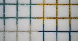
In most cases, White grout can appear very stark, and will emphasize imperfect cuts or irregular laying patterns, due to its tendency to draw the eye. Consider using a pale cream or the softest of greys instead. This can make your mosaics look a little softer, and less sterile. Of course, there are always exceptions to the rule, such as works containing a lot of white tesserae. I also think true white works exceptionally well with citrus colours – lime, orange and yellow – or with soft blues, as in the images below.

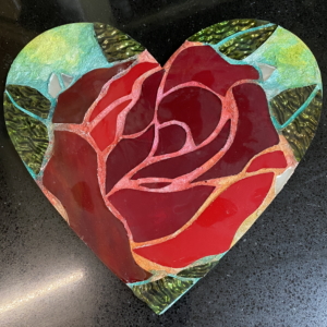
Conversely, Black is often the colour of choice, without people really understanding why. As previously stated, it does push other colours forward. But beware! Black grout can add a dramatic feel to your mosaic that may not be what you intended. Knocking it back to a deepish grey or brown can still push other colours, without adding the strength that black imparts. Consider a Valentine Heart piece done in all reds – it could look quite foreboding if grouted in black, but could look romantic if grouted in red, for example. Please note that more black grouts tend to dry to a dark charcoal, so if you are after a dense, deep black, the addition of black pigment to your black grout is advisable.
What can Grout Colour do for you?
Grout colour can unify, break apart, or be neutral within your artwork. You must decide what you want it to do for you before you grout.
So often I see people state that “white fractures, and black unifies” – but that is not always the case. Black will fracture a white area of tesserae, while white will unify it. So the more correct statement is “Contrasting grout fractures and Like-coloured grout unifies”.
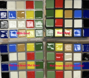
Look at the example below, so often trotted out on FaceBook forums. My analysis of it is a little different to most:

1&2: the use of grout colours similar to the tesserae serve to unify that colour – orange grout unifies the orange, whilst fracturing the blue, whereas the blue grout unifies the blue, whilst fracturing the orange
3&4:The black and white grout choices here are both different from the tesserae, so both fracture, or break apart the work – but the white or light grout is a much softer effect that then drama of the black-grouted piece.
5&6: show the effects of a a couple of neutral shades. Sometimes grey can look like the “safe, boring” choice, and can remind us of its cementitious nature. A similar effect could be achieved if the grout were in brown tones, whilst moving away from the “safe” grey.
Plan your grout colour at the start
Including the grout colour into your colour selection at the beginning of your project can help your grout to “make” your project rather than “break” it! To be sure that your grout colour enhances your choice of tesserae, consider making a small sample board to try out a number of options. Consider areas where you may wish to use contrasting tesserae – what colour grout will you use – what area to do you want to highlight?
Colouring your grout
There are many ways you can colour your grout – some successful, some not so. The best base for colour mixing is white grout (rather than grey).
- Adding acrylic paint:
- invariably fades outdoors, or in areas subject to strong light
- too much may weaken the chemical bond of your grout – making it chalky and prone to cracking
- Adding food colouring:
- most food colouring is fugitive (after-all, coloured foodstuffs aren’t expected to be around for long), and will fade
- Adding cement oxide:
- these work well with grout and cement-based adhesives, and typically don’t fade
- the colour range is somewhat limited.
- Adding Pure (Artists) Pigment:
- Pigments have a maximum load – adding more than this will not deepen the colour – it will just waste your money.
- Some pure pigments are opaque, and colour-fast – but they can be VERY expensive. Mix too much into your grout, and you risk weakening the chemical structure
- some pigments are transparent – so they can become quite pale when mixed into white cement
- some pigments are fugitive – always check the light-fastness rating of your pigment before use
- the quality of pigments vary
- Adding Pigments specifically designed for cement products:
- Few and far between – these are the BEST way to colour your grout.
- Suitable for outside use, good quality pigments should not fade.
- Check out Rainbow Colorants by Karen Sasine. These are sold in Australia & New Zealand by Merlin Mosaica
- Painting your Grout lines:
- this method is often used by realistic mosaic artists, where the intent is to have grout “disappear”. Grout lines are typically narrow, and white grout is used. it is then painted with acrylic paint to match the tesserae. the paint wipes off the tess easily enough
- not suited for external installations.
- Some artists use exceptionally wide “swathes” of grout and daub colour onto the grouted areas. This can look spectacular, but again is limited to interior pieces.

When adding pigments or oxides to your grout, it is always best to add the dry colourants to the dry grout or adhesive. Mix thoroughly, and then take a sample and add liquid. Let the sample dry fully – the final colour will be apparent only once it has dried. Make sure you mix enough dry product to complete your piece, as it is VERY difficult, almost impossible, to achieve exactly the same mix. Take note of the weight of product and colourant you add, and make a record of that. Also, the amount of liquid you add can have subtle impacts on the end colour.
NOTE: A fugitive colour is a pigment that, when exposed to certain environmental conditions such as sunlight, humidity, temperature or even pollution, is less permanent. Over time the colour can change, lighten, darken or even almost disappear. Basically think of fugitive colours as temporary.
Harsh Conditions
The Australian climate is wonderful, but our sunshine is considered amongst the harshest in the world. With our UV exposure and skin cancer rates among the world’s highest, it’s an uncomfortable reality Australia really is a sunburnt country. There’s no benefit in burying our heads in the sand, however. What does this have to do with grout, you may ask? Our UV levels means that most paints will fade quite quickly outdoors. That applies to coloured grouts too. So, if you are using coloured grout outdoors, consider using a UV resistant grout sealer, such as Aqua-Seal Gold.
For more of my mosaic articles, go here: https://merlinmosaica.com/articles/


Leave a Reply
Want to join the discussion?Feel free to contribute!