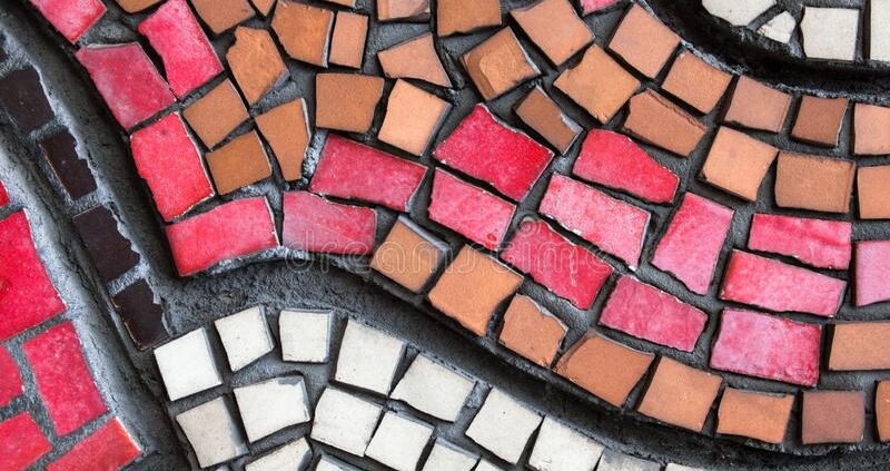
Laying Tesserae – Why the Opus (Laying Pattern) matters
Just found this response to a question on laying tesserae. Am posting it here with the authors (Dara Agnew Wandel) kind permission.
In a sense, you are “drawing” with your tesserae and that includes their shapes and the spaces between them. You are not just filling in spaces with a colour. It DOES matter which tesserae shapes you choose, how you place them, and where your grout lines fall.
Radically shifting shapes, without purpose, especially within a single colour field, will create confusion. It’s like scribbling with a crayon. You get colour “between the lines,” but otherwise create chaos that detracts and distracts.
This is one reason why some hate grouting so much, and others refuse to grout. Grouting emphasizes the random choices or mistakes that disrupt the “drawing.” You are better off being random in ALL things than to simply change direction for no purpose.
Choose or change tesserae shapes or sizes or their placement and their direction of “flow” in ways that conform to your design and create a consistent and deliberately “drawn” field. USE grout spaces between tesserae to emphasize line and the flow of your design. Place tesserae of a specific shape to indicate a fold or shadow or other feature of your “drawing.” Each tile, each space between each tile, each variation in a colour or nipped shape should be deliberate.


 ©Ali Howson
Leave a Reply
Want to join the discussion?Feel free to contribute!